DURATION
3 Months
ROLE
Solo Designer,
Interviewer
SCOPE
UX Research,
Motion & UI Design,
Usability Testing,
Prototyping
OVERVIEW
Current automotive infotainment systems suffer from poor usability. This project addresses common user frustrations, such as complex phone pairing and navigation, by developing a more intuitive and practical alternative. My process involved synthesising feedback from user interviews and market research to define the core problems and design a user-centric solution for today's vehicles.


Project Timeline
During the winter months of 2020 I began planning out the project to stay on track with the deadline of my submission for University applications. You can see the timeline above of how I broke down my design process.
Instead of jumping directly into design, I began with in-depth research to develop a comprehensive understanding of existing usability challenges. This foundational work was crucial for defining the project's core problems and scope. This structured approach ensured that the final design was not just an aesthetic exercise, but a well-defined solution addressing validated user needs.


My 2020 analysis is grounded in both qualitative and quantitative research. Primary data was gathered through user interviews, while secondary data was derived from authoritative industry sources. Key publications from J.D. Power, particularly their annual Initial Quality Study (IQS), and consumer surveys from Consumer Reports formed the basis of my investigation into prevalent infotainment issues.
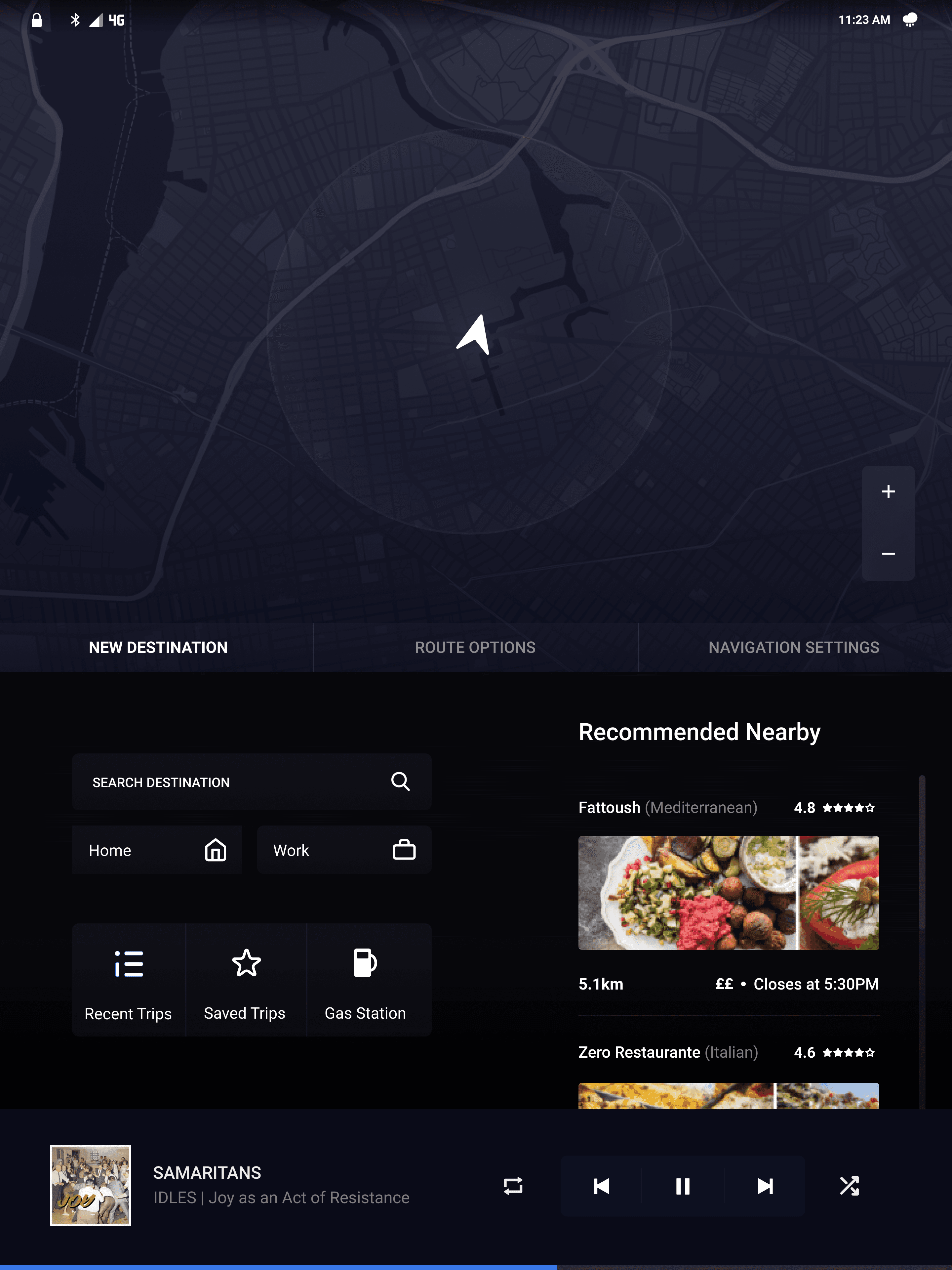
The Problem
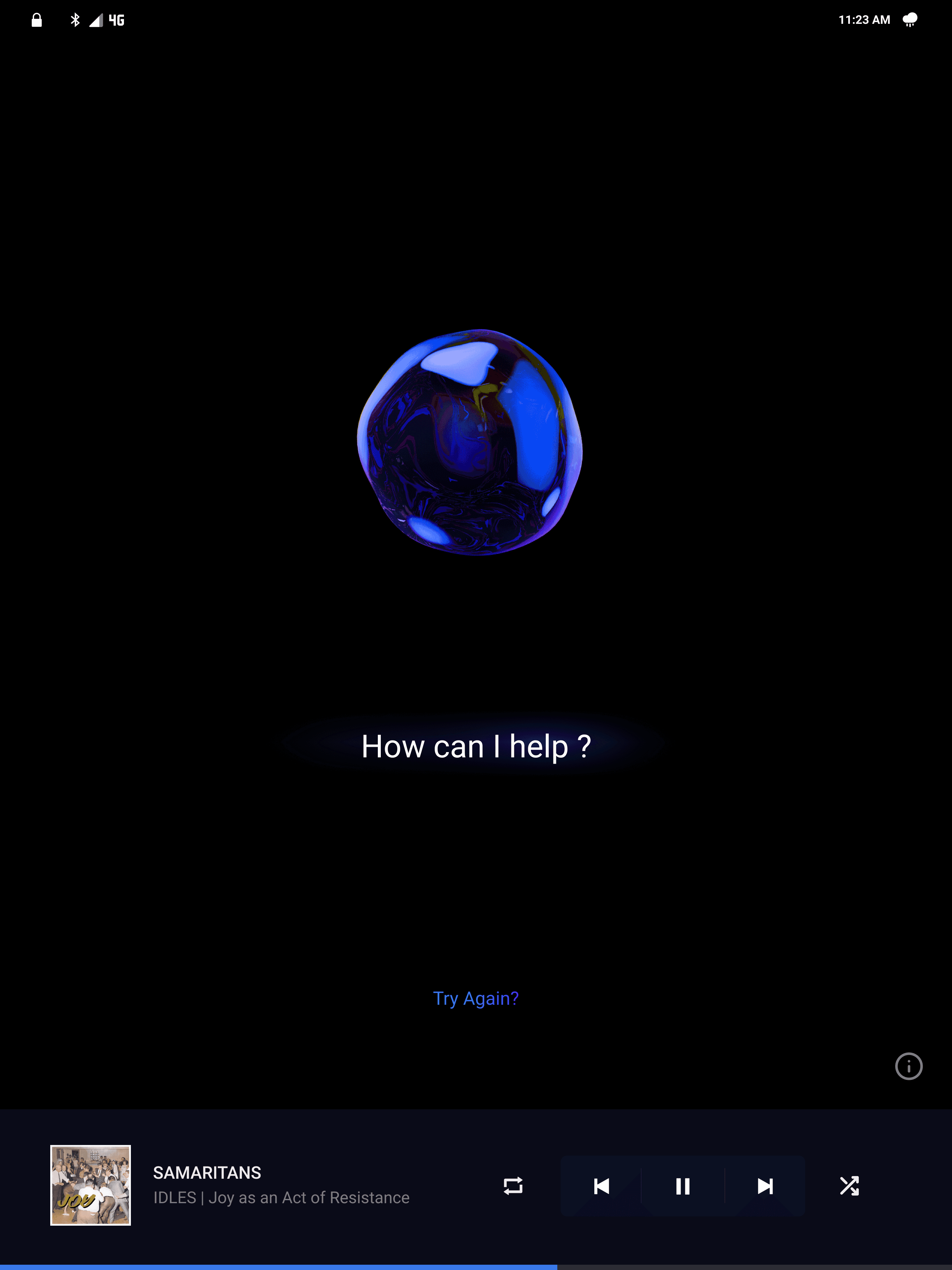
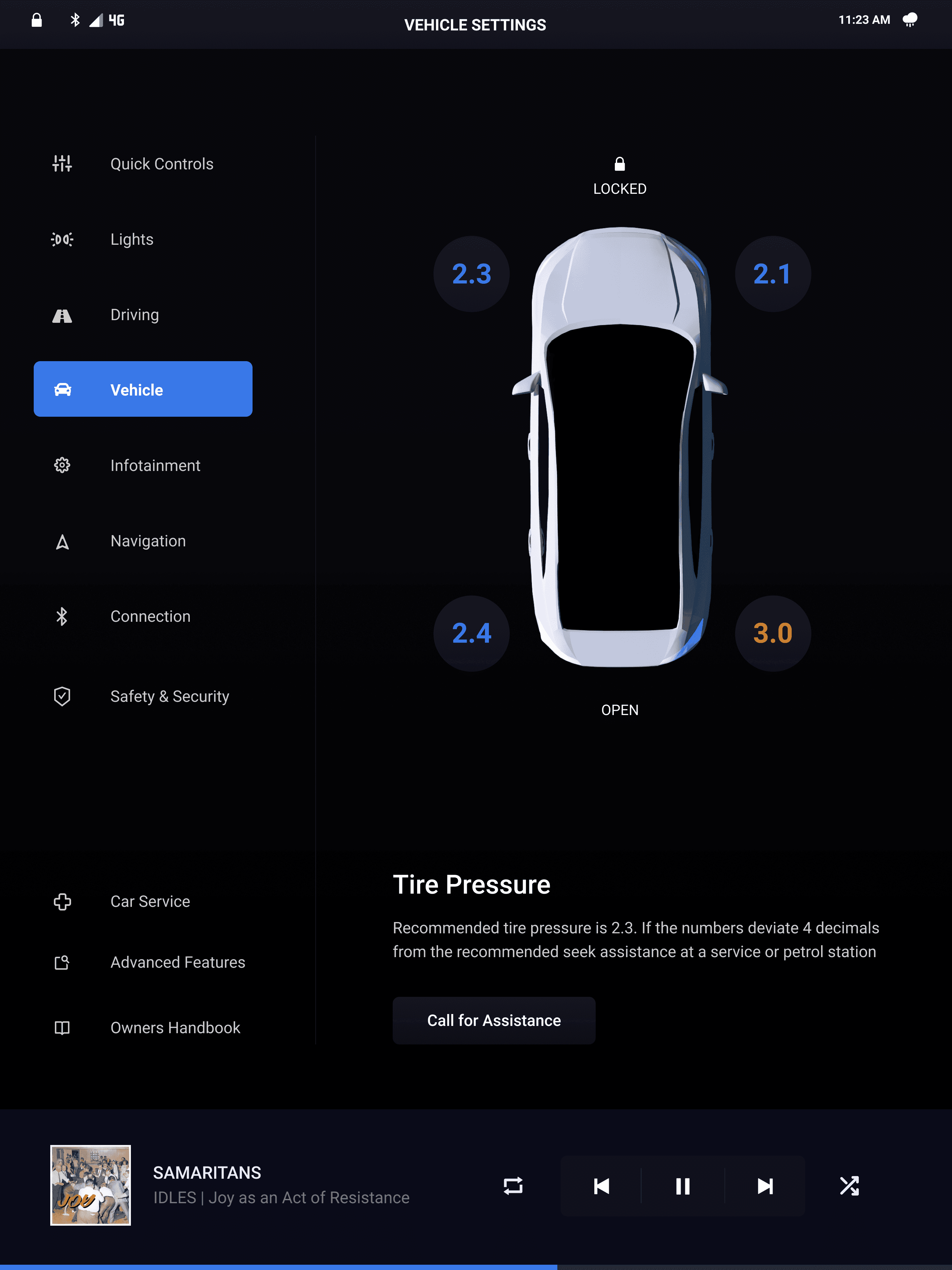
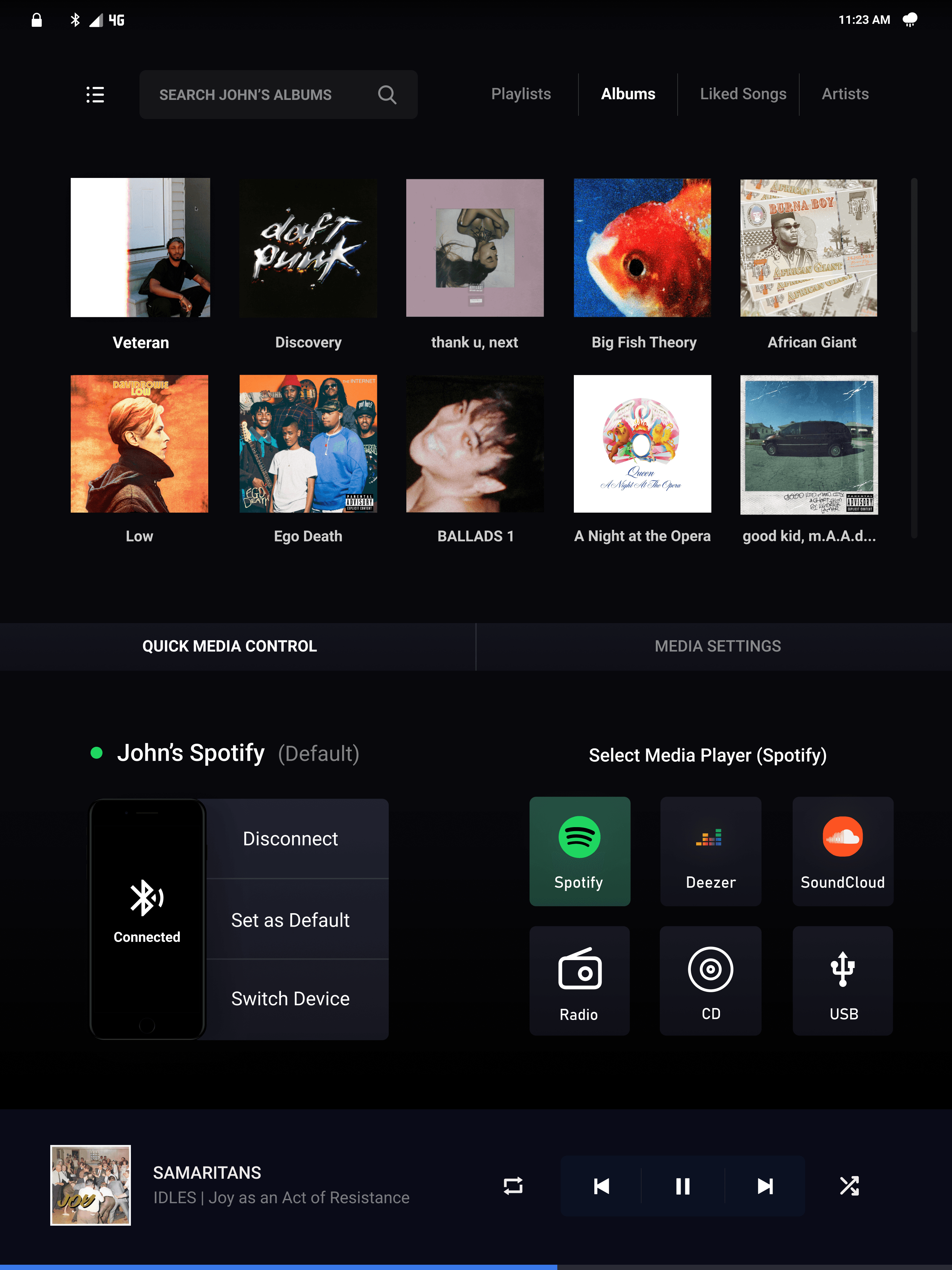
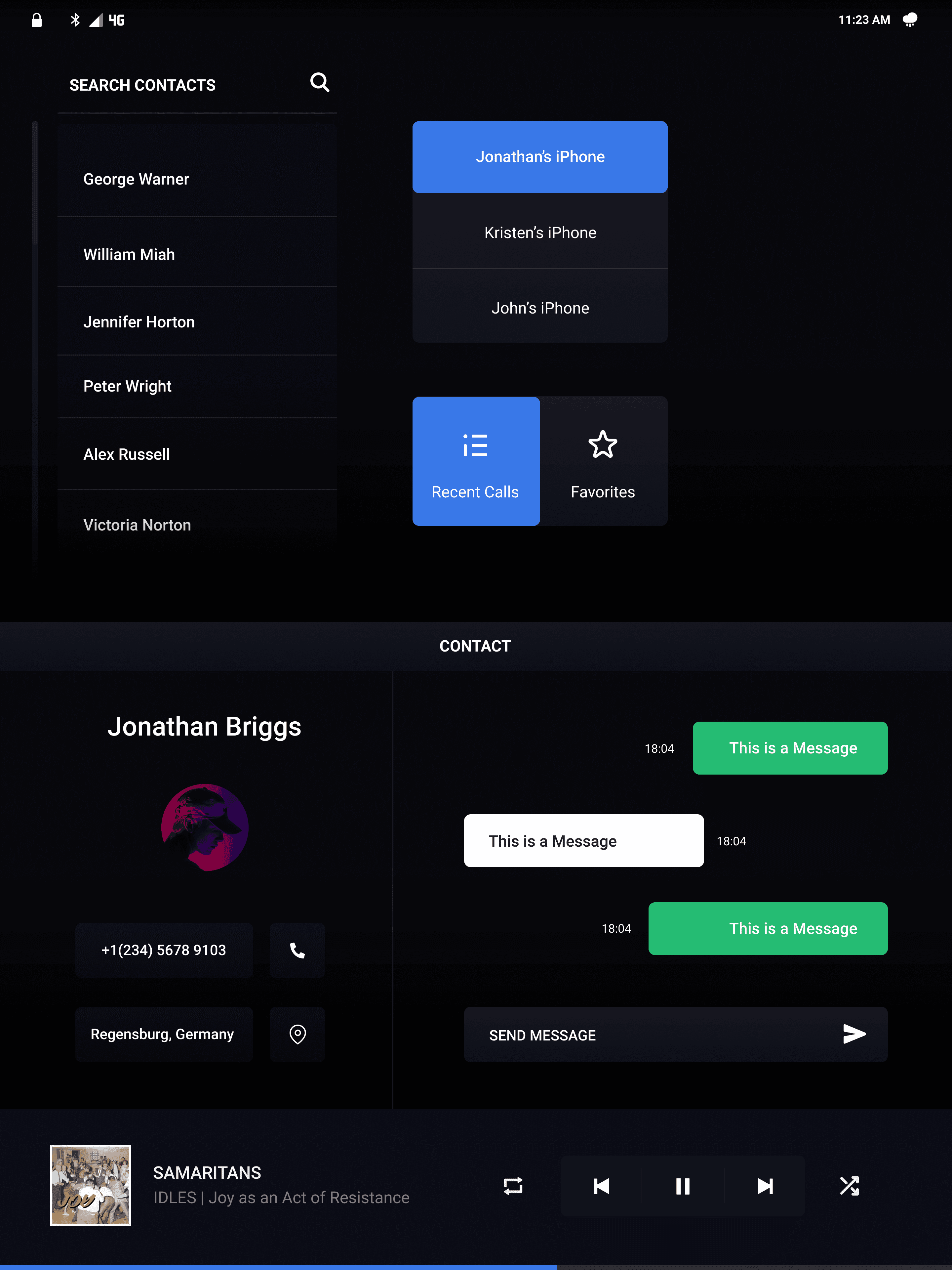
Current infotainment systems frequently undermine the driving experience. They suffer from inefficient design, making simple tasks like navigating menus or adding a waypoint unnecessarily complex. Searching through media libraries is time-consuming, and outdated navigation maps can lead drivers astray. Furthermore, unreliable voice recognition and cluttered interfaces packed with redundant features force drivers to divert their attention from the road, making it difficult to perform even basic actions like connecting to Bluetooth or adjusting settings.
Opportunity
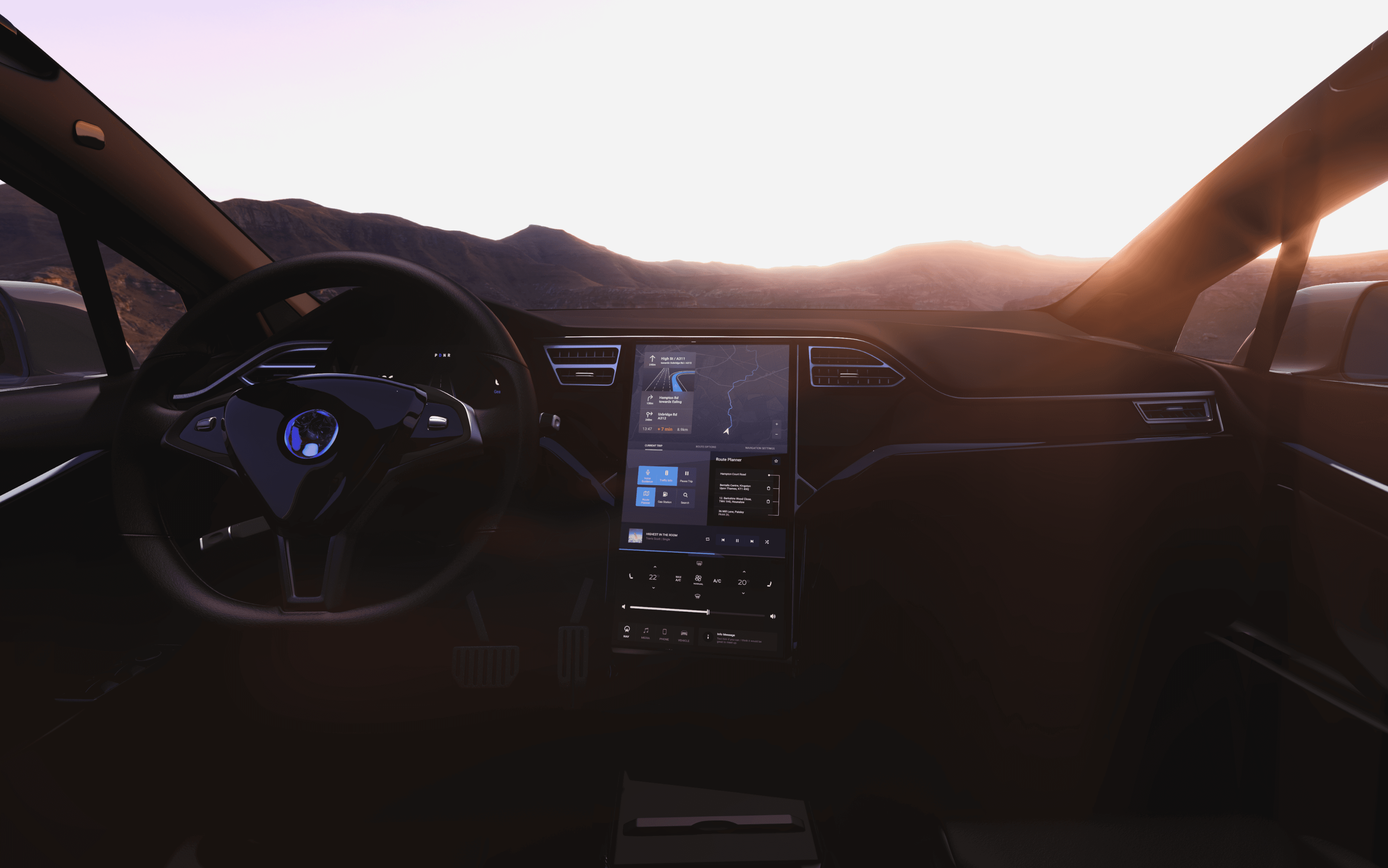
There is a significant opportunity to create a safer and more efficient driving experience by developing an intelligent and intuitive infotainment operating system. By focusing on a distraction-free, voice-first interface, we can streamline the user's interaction with the dashboard. This reimagined system will simplify common tasks, maximize efficiency, and ultimately improve the connection between the driver and the vehicle. While this project is an iterative improvement on current systems, it lays the groundwork for a fully realized, advanced automotive interface.
As of 2025, user frustration with infotainment systems has intensified and become more complex. While basic screen technology has improved, the industry-wide push for massive touchscreens, removal of physical buttons, and deeper, more complicated software integration has led to a decline in overall new vehicle quality, according to recent studies. The core problem has shifted from simple connectivity issues to fundamental software instability, poor user interface design, and driver distraction. The most reliable systems are now often the simplest, while feature-rich, screen-dominant systems are the most complained-about.
I came up with two different personas based on my research findings. They encapsulate the pain points of modern infotainment systems and what the users ideal experience would be. It helped me clarify what specific aspects of the experience and features to focus on. Going back to these throughout the design process proved to be very useful.


navigation
media

my vehicle

communication
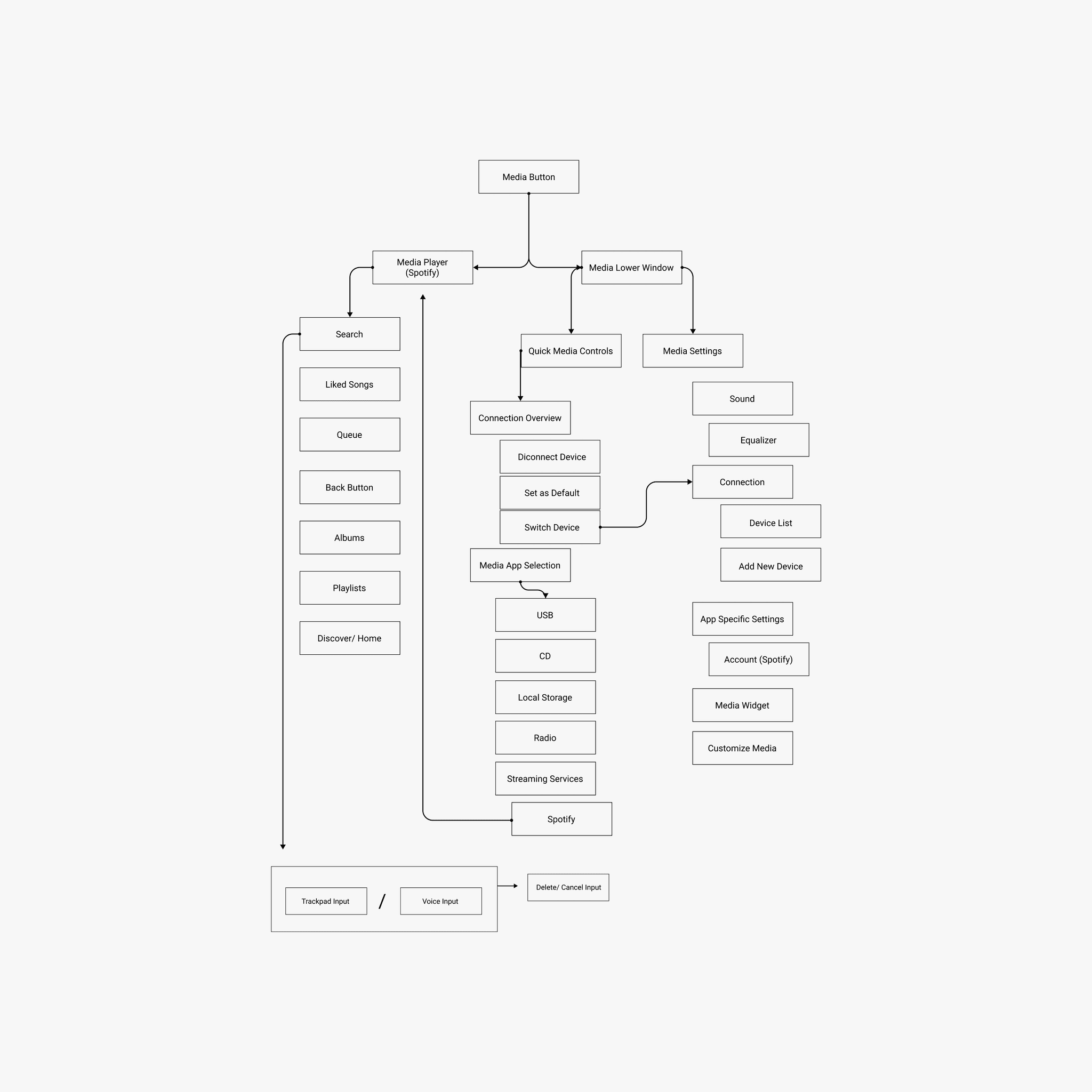
Building the information architecture was a meticulous but essential process. Lacking extensive prior experience with in-car systems, I started by conducting a thorough, hands-on analysis of my family's BMW 'Connected Drive'. I mapped its core functionalities and compared them with systems from other manufacturers to establish a baseline. Instead of getting lost in deep submenus, I deliberately focused on the high-impact features that presented the most significant user problems. This research allowed me to build a defined and logical information structure tailored to my system's goals.

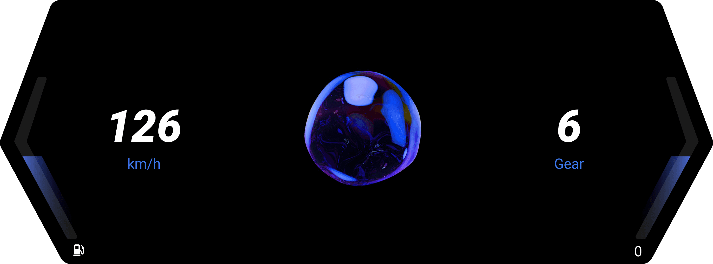
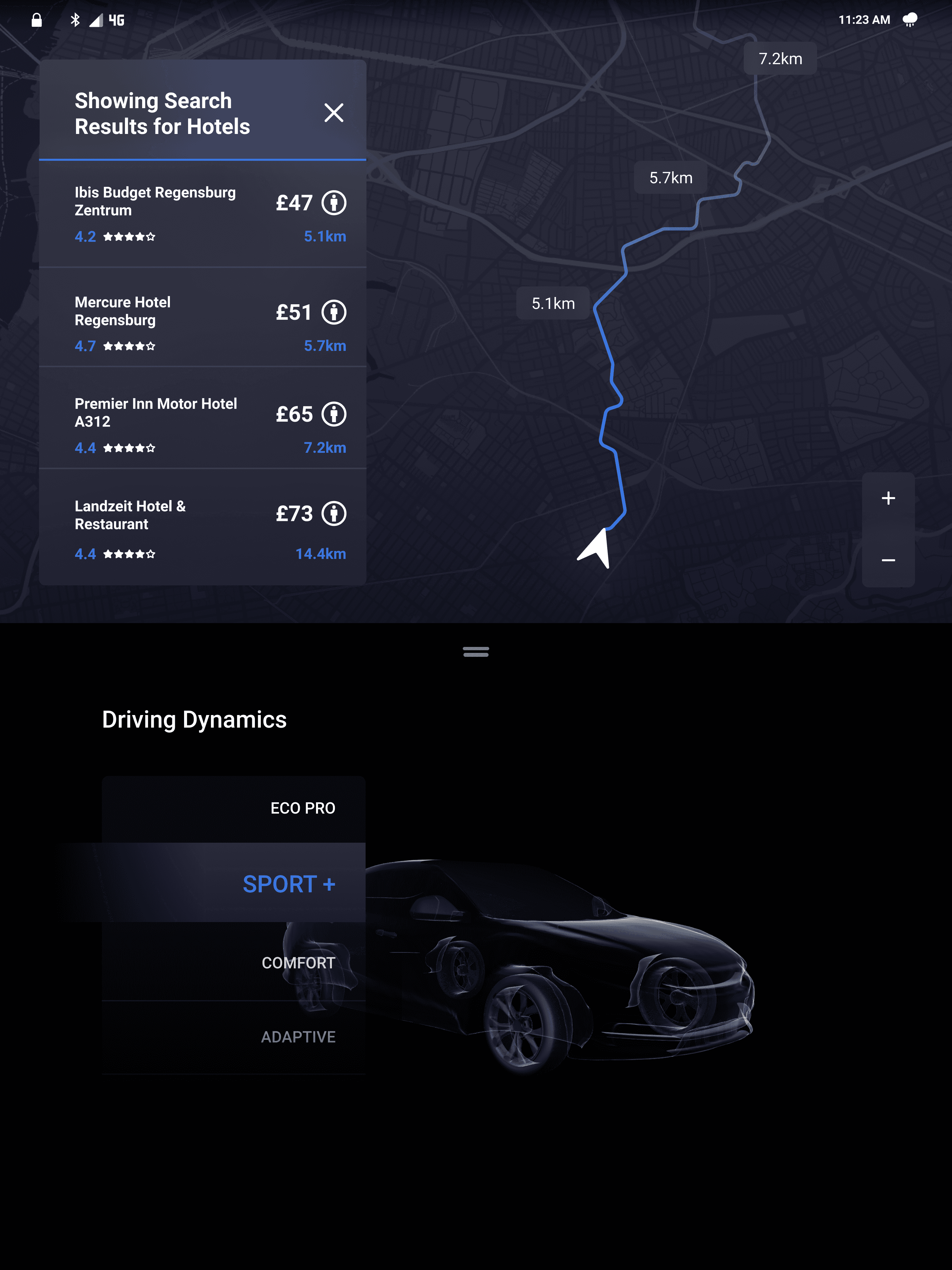
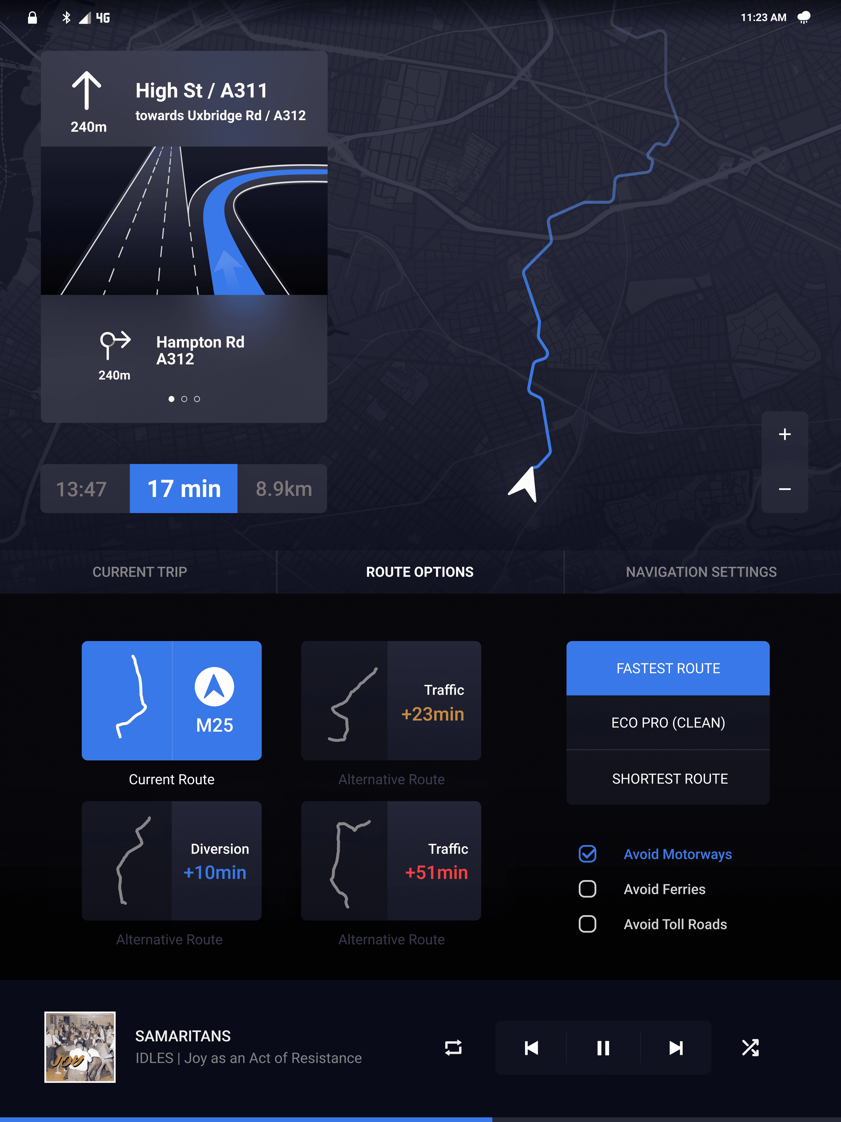
The design phase began with some basic sketching to explore efficient layouts for displaying information. A key insight from this initial step was that a larger screen was essential to reduce interaction complexity for the user.
These concepts were translated into low-fidelity wireframes, which helped clarify the user's journey through the product. This process was invaluable, as it exposed early errors in the information structure that were not immediately obvious. Identifying these issues compelled me to revise the concepts, ultimately leading to a more logical and user-friendly layout. This iterative cycle underscores the importance of early wireframing in building a solid design foundation.